Vancord: A Futuristic Display Font for Digital Design
When you are building a digital product, every pixel communicates something. The typeface you choose for a landing page, an app screen, or a brand header sets the tone before a single word is read. Vancord is a techno display font designed for that exact moment. It brings a futuristic, clean, and innovative feel to any screen-based project. As a web designer working with startups, SaaS platforms, and digital brands, I have found that Vancord fills a specific gap: it gives you a strong visual identity without sacrificing the legibility that modern layouts demand. This font is not a background player; it is a statement piece that works best when you need to signal progress, technology, and forward-thinking design.
The Visual Personality of Vancord
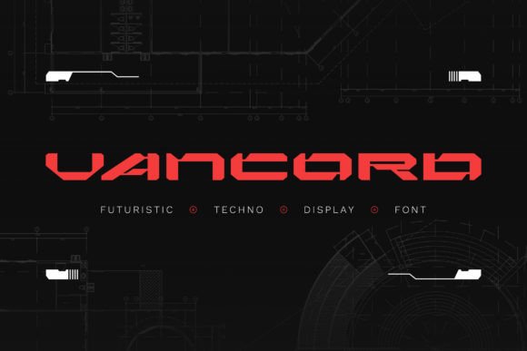
Vancord is a display typeface with a distinct techno character. Its letterforms are geometric, precise, and slightly condensed, giving it a compact presence that feels both authoritative and sleek. The strokes are even, the terminals are sharp, and the overall impression is one of engineered clarity. This is not a font that tries to mimic handwriting or organic shapes. Instead, it embraces a machine-made aesthetic that aligns perfectly with modern tech branding. The x-height is generous, which helps with readability even at smaller display sizes, and the spacing is tight enough to create a cohesive block of text but open enough to avoid crowding.
In terms of digital appeal, Vancord sits comfortably alongside other modern display fonts but stands out because of its restrained futurism. It does not rely on excessive ornamentation or gimmicky cuts. Instead, it uses subtle geometric details and a consistent rhythm that makes it feel both advanced and professional. This is a font that would look at home on a fintech dashboard, a cybersecurity landing page, or a premium app store preview. It carries a tone of innovation without screaming for attention.
Where Vancord Shines in Web Design
From a practical standpoint, Vancord is not a body text font. It is a display typeface, which means it excels in short, impactful applications. Here are the areas where it performs best in a web design context:
- Hero sections and headers: The bold, geometric forms make Vancord ideal for primary headlines. When you place it at 48px or larger on a hero section, it immediately establishes a tech-forward brand identity. The font carries weight and presence, which helps anchor the page.
- Call-to-action buttons: Short phrases like "Get Started" or "Launch App" benefit from Vancord's condensed structure. It allows you to fit more characters into a button without shrinking the font size, keeping the CTA readable and punchy.
- Navigation and menu items: For one-word or short menu labels, Vancord adds a premium, modern feel. It works well in top navigation bars where you want to reinforce the brand tone without overwhelming the user.
- Logo text and wordmarks: If you are designing a digital brand kit, Vancord can serve as the primary wordmark font. Its geometric consistency makes it easy to pair with a simple icon or mark, and it scales well from favicon to billboard.
- Decorative accents and section headings: Use Vancord for subheadings, stats, or highlighted quotes. It can break up long blocks of content by adding visual contrast.
Vancord is less suitable for long-form body copy, paragraph text, or dense informational content. For those areas, you will want to pair it with a simpler, more neutral typeface. But as a display tool, it is remarkably versatile for the digital space.
Readability and Visual Hierarchy
Readability in digital design is not just about legibility; it is about guiding the user's eye through the content. Vancord contributes to a clear visual hierarchy because of its distinct personality. When you use it for a primary headline, it immediately signals importance. The user's eye is drawn to it before anything else on the page. This is crucial for conversion-focused layouts where you want the main value proposition to be seen first.
On mobile screens, Vancord holds up well because of its generous x-height and open counters. Even at smaller sizes, the letters remain distinct. However, I recommend using it at a minimum of 24px for headings and at least 32px for hero text to ensure clarity. On very small screens, you may want to increase letter-spacing slightly to improve readability. The font's geometric nature means it works well on both light and dark backgrounds, but it truly pops on dark surfaces. A white or light-colored Vancord headline on a dark gradient or image overlay creates a strong, modern contrast that feels premium.
When it comes to brand trust, a consistent typeface choice signals professionalism. Vancord, with its clean lines and futuristic feel, tells the user that the brand is intentional, modern, and detail-oriented. This is especially important for tech startups, app developers, and digital agencies that need to convey reliability and innovation simultaneously.
Practical Examples for Digital Creators
To give you a concrete sense of how Vancord can be applied, here are a few real-world scenarios:
- Creative portfolio site: Use Vancord for your name in the hero section and for project category labels. Pair it with a simple sans serif for project descriptions. The contrast between the bold display font and the neutral body copy creates a clean, professional rhythm.
- Boutique online store: For a store selling modern tech accessories or digital products, Vancord can be used for product names, sale banners, and promotional headers. It gives the store a curated, high-end feel that stands out from generic e-commerce templates.
- Coaching or course sales page: Use Vancord for the main headline and key benefit statements. For example, "Transform Your Workflow" in Vancord immediately communicates a modern, results-oriented approach. The body text can use a serif or sans serif for readability, while the headings retain the futuristic vibe.
- Product landing page for a SaaS tool: Vancord works well for the tagline, feature highlights, and the main CTA button. It reinforces the idea that the tool is cutting-edge and efficient. I have used it for a project management app landing page, and the client reported higher engagement on the headline section.
- Blog header and digital brand kit: For a tech blog, Vancord can be used for the blog title, author names, and pull quotes. It adds a consistent visual identity across the site without requiring heavy graphic design.
Responsive Design and Readability Tips
When using Vancord in a responsive layout, consider the following best practices:
- Test at multiple breakpoints: Vancord looks great on desktop and tablet, but on mobile under 400px width, you may need to adjust the font size or increase letter-spacing slightly to maintain clarity.
- Use it on dark backgrounds with care: While Vancord works well on dark surfaces, ensure the contrast ratio is high enough for accessibility. White text on a dark navy or charcoal background is a safe combination. Avoid placing it on busy image overlays without a subtle gradient or shadow behind the text.
- Image overlays: When using Vancord over a background image, add a dark or light overlay with at least 40% opacity to ensure the text remains readable. The font's geometric shapes can sometimes blend into complex backgrounds, so the overlay is essential.
- Small buttons: For buttons smaller than 40px height, consider using a more neutral font for the label. Vancord is best at larger sizes where its details can be appreciated.
- Light backgrounds: On light backgrounds, Vancord in black or dark gray works well. Avoid using light gray or thin weights on white, as the contrast may be too low for comfortable reading.
Font Pairing Strategies for Vancord
Because Vancord has a strong personality, it benefits from being paired with a neutral, readable typeface for body text and supporting elements. Here are a few pairing approaches that work well in digital design:
- With a simple sans serif: Fonts like Inter, Open Sans, or Roboto balance Vancord's geometric display style. The sans serif provides a clean, unobtrusive body copy that lets Vancord shine in the headings. This is the most common and reliable pairing for landing pages and app screens.
- With a serif for editorial identity: If you want a more editorial or sophisticated feel, pair Vancord with a classic serif like Merriweather or Lora. The contrast between the futuristic display font and the traditional serif creates a dynamic tension that works well for digital magazines, thought leadership blogs, and premium course pages.
- With a monospace for technical contexts: For developer tools, documentation sites, or data-heavy dashboards, pairing Vancord with a monospace font like Source Code Pro can reinforce the tech theme. This pairing is especially effective for code snippets, command-line interfaces, or analytics dashboards.
- With a script or handwritten font sparingly: If you need a decorative accent, a subtle script font can add a human touch next to Vancord's mechanical feel. Use it only for short quotes or author names, and ensure the script does not compete with the display font.
When pairing, keep the hierarchy clear: Vancord for primary headings, the paired font for body text, subheadings, and smaller UI elements. Test the combination on a few key pages to ensure the contrast feels intentional rather than jarring.
What to Check Before You Buy
Before you commit to using Vancord in a client project or your own digital product, there are a few practical details to verify. First, check the font file formats included. For web use, you will need WOFF and WOFF2 formats. If the font is available as a webfont via a service like Google Fonts or a self-hosted option, that makes integration smoother. If not, you may need to convert the files or use a tool like Font Squirrel's generator.
Second, review the number of styles and weights. Vancord may come in a single weight or a small family, which is common for display fonts. Ensure that the weight you need for headings and buttons is included. If you need multiple weights for a more layered hierarchy, confirm that the family offers them.
Third, check for alternates, ligatures, and stylistic sets. Some display fonts include alternate characters or special glyphs that can add variety to your headlines. If Vancord offers these, they can be useful for logo design or unique headers.
Fourth, consider multilingual support. If your project targets a global audience, verify that Vancord covers the character sets you need, such as accented Latin characters or Cyrillic.
Finally, and most importantly, review the commercial font licensing. Using Vancord on a website, in a client project, or as part of a digital template requires a proper license. Check if the license covers web use, embedding, and the number of domains or page views. For client work, you may need an extended license that allows for redistribution. Always read the license agreement carefully to avoid legal issues. A good practice is to keep a copy of the license for your records and ensure your client understands the terms if you are handing off the assets.
Vancord is a tool that can elevate your digital design when used with intention. It is not a font for every project, but for the right ones—those that require a futuristic, tech-forward, and professional identity—it performs exceptionally well. By focusing on its strengths in display applications, pairing it with a readable body font, and following the readability tips outlined here, you can create layouts that are both visually striking and functionally sound. Whether you are building a landing page, an app interface, or a complete brand identity, Vancord gives you a distinctive voice that speaks to the future of digital design.