Switch System: A Web Designer’s Review of a Bold Display Font
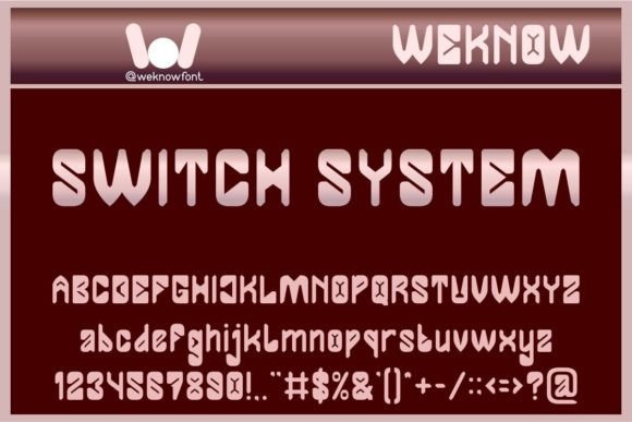
When I first loaded Switch System onto my digital artboard, I was immediately struck by its confident geometry. I was in the middle of redesigning a landing page for a modern creative tech studio, and the hero section felt flat. The sans-serif I was using was clean, but it lacked personality. I needed a typeface that could sit large over a dark, abstract video background and command attention without feeling cold or robotic. Switch System promised a techno-various aesthetic, and after testing it across multiple layouts, I can confidently say it delivers a unique blend of futuristic precision and creative warmth. This is a hands-on review from a web designer’s perspective, exploring how this display font performs in real digital projects.
A First Look at Switch System in Digital Layouts
Switch System is not your average decorative font. It belongs to the display font category, but its personality is distinctly its own. The letterforms are built with a geometric, almost modular structure, featuring uniform strokes and a generous x-height. What surprised me, however, was its warmth. While it carries a clear "techno" influence, it avoids feeling purely mechanical. There is a crafted, deliberate quality to each character that makes it feel approachable. This is a premium font that instantly communicates innovation and design-forward thinking. For a web designer, this means it is an excellent candidate for hero titles, logo text, and key branding elements where you need to establish a strong visual hierarchy without relying on heavy imagery.
Testing Readability and Responsive Performance
One of the first things I do with any new typeface is test its readability across different screen sizes and backgrounds. I placed Switch System into a Figma file for a creative agency portfolio. At 96px on a desktop hero section, the font was incredibly legible. The open apertures and distinct letterforms meant that even at large sizes, there was no confusion between characters like "B" and "R" or "a" and "e". It handled the bold weight beautifully, creating a crisp, impactful headline.
Next, I tested it on a mobile viewport. This is where many display fonts fail. They become too dense or lose their detail. Switch System held up surprisingly well for short section headers and call-to-action buttons. At 24px to 32px, it retained its character without sacrificing clarity. However, I would not recommend it for body copy or small captions. Its strength is in making a statement. For a balanced layout, you will need to pair it with a clean, neutral sans-serif for the main content. I also tested it over an image background with a dark overlay. The font’s geometric shapes cut through the noise effectively, maintaining excellent contrast and ensuring the text remained the primary focal point.
Real Case: Building a Boutique Digital Brand
To truly evaluate Switch System, I applied it to a mock homepage for a boutique online store selling curated tech accessories. The brand identity was built around a color palette of dark charcoal, electric blue, and silver. The goal was to make the products feel premium and innovative.
- Hero Section: I used Switch System for the main banner headline: "Designed for the Future." The font’s confident geometry immediately elevated the perceived value of the products. It felt like a natural extension of the hardware—clean, precise, and modern.
- Navigation and Category Headers: I used it for the primary navigation brand logo and the product category headers. The consistency across the user interface created a cohesive, premium feel. It signaled to the user that this was a curated, design-led experience.
- Call-to-Action Buttons: I tested it on a primary CTA button. The font added a touch of personality to the interface, making the button feel more like a branded element and less like a generic UI component.
This real case exercise confirmed that Switch System is excellent for establishing a strong brand identity on the web. It works best when used sparingly and intentionally, allowing its unique character to shine without overwhelming the user.
Technical Checks and Font Pairing for Web Projects
Before committing to a typeface for a client project, there are essential technical considerations. Switch System needs to be handled correctly to ensure optimal performance and compliance.
Technical Considerations:
- File Formats: Ensure you have the correct webfont files. WOFF2 should be your primary format for modern browsers, offering the best balance of file size and rendering speed. Always include WOFF as a fallback.
- Licensing: This is a commercial font. Always verify the web license agreement. If you are using it for a client’s website, an Extended Web License is typically required. Do not assume standard desktop licensing covers web embedding.
- Multilingual Support: Check the character set. If your project requires extensive language support (like Central European, Cyrillic, or Greek), verify the glyph coverage before purchasing.
- Performance: Only load the specific weights and styles you need. Loading unnecessary font files can impact your Largest Contentful Paint (LCP) and overall page speed.
Font Pairing Suggestions:
Finding the right partner for a bold display font is crucial for a balanced user interface. After testing several combinations, I found these pairings to be exceptionally effective:
- Switch System + Inter: A safe, modern, and highly readable combination. Inter is a neutral sans-serif that gets out of the way, letting Switch System be the star of the show. Ideal for most digital projects.
- Switch System + Source Serif 4: If you want to introduce an authoritative or editorial feel, pairing it with a sturdy serif creates a beautiful contrast between the geometric display face and the traditional serif. This works well for blogs or magazine-style layouts.
- Switch System + a delicate handwritten font: For a more playful or creative brand, a simple monoline script can balance the boldness of Switch System, adding a human touch to the digital experience.
Balancing Bold Typography with User Experience
From a UX perspective, visual hierarchy is paramount. Switch System excels here because it naturally draws the eye. It signals "this is important" without needing to be overly large or brightly colored. However, it is equally important to know where not to use it. Avoid using Switch System for dense blocks of text, small navigation links, footers, form labels, or any accessibility-heavy interface where clarity at small sizes is critical. It is a display font through and through, and treating it as such will yield the best results.
Switch System is a powerful addition to any digital designer’s toolkit. It offers a unique blend of technological precision and creative warmth. For landing pages, hero sections, and digital brand identities that need to stand out, it is absolutely worth considering. Just remember to pair it wisely, respect its role as a display font, and always test it on real devices before launching. When used correctly, it can transform a standard layout into a memorable, brand-forward experience.